Design and illustration by Karen Lilje
Every book cover needs to tell the story of a story, drawing you in without giving too much away. A good cover design captures the essence of the book and provides a glimpse of the world within. Here is a selection of book cover design work done for a variety of publishers, including Pan Macmillan, Penguin Random House and Wits University Press.
The design and development process of this book was as exciting as the final outcome.
To initiate the project a series of possible design solutions were presented and reviewed. The chosen design concept was then crafted and the final book illustrated and designed.
The content of the book is presented creatively, with every page different to the one before. The illustrations are carefully considered and conceptually represent and support the text content.
Simultaneously a strict yet simple grid structure is adhered to throughout. This holds the design together and helps the user understand and follow the flow of the book. Consistent styling of text elements and page structure provide visual cues to the reader so that they can navigate the content effortlessly while enjoying a visually varied narrative journey.
The book is an aesthetic adventure and each spread is a feast for the mind.
Series cover design means crafting each individual title within specified design parameters, which need to be carefully considered. Every cover needs to be strong enough to stand on its own while still visually in keeping with the rest of the series. This is a unique design challenge.
This fun annual report was designed for the City of Cape Town. It captures the vibrancy and excitement of the Soccer World Cup, which was hosted by South Africa in 2010. The report is filled with beautiful photography, complimented by colourful infographics that creatively convey informative statistics.
This beautifully designed annual report is more than just a report. It is a crafted book.
The plain red cover incorporates a simple die-cut that reveals selective letters printed on the first page to spell out the book title, “How Ordinary Poeple got Connected”.
The page design incorporates creative typography, with content designed to read as an engaging narrative alongside more data-heavy information. Dense text is punctuated by bold, full-page pull quotes. A series of detailed illustrations were created, using photographic reference, and are used throughout the report to support the text.
The Economic Contribution Report, designed for the V&A Waterfront in Cape Town, included a series beautifully illustrated infographics that presented data in an original and relevant way. Recognisable landmarks and features were photographed and then translated into detailed line drawings, including a full architectural panorama of the Waterfront for the cover spread.
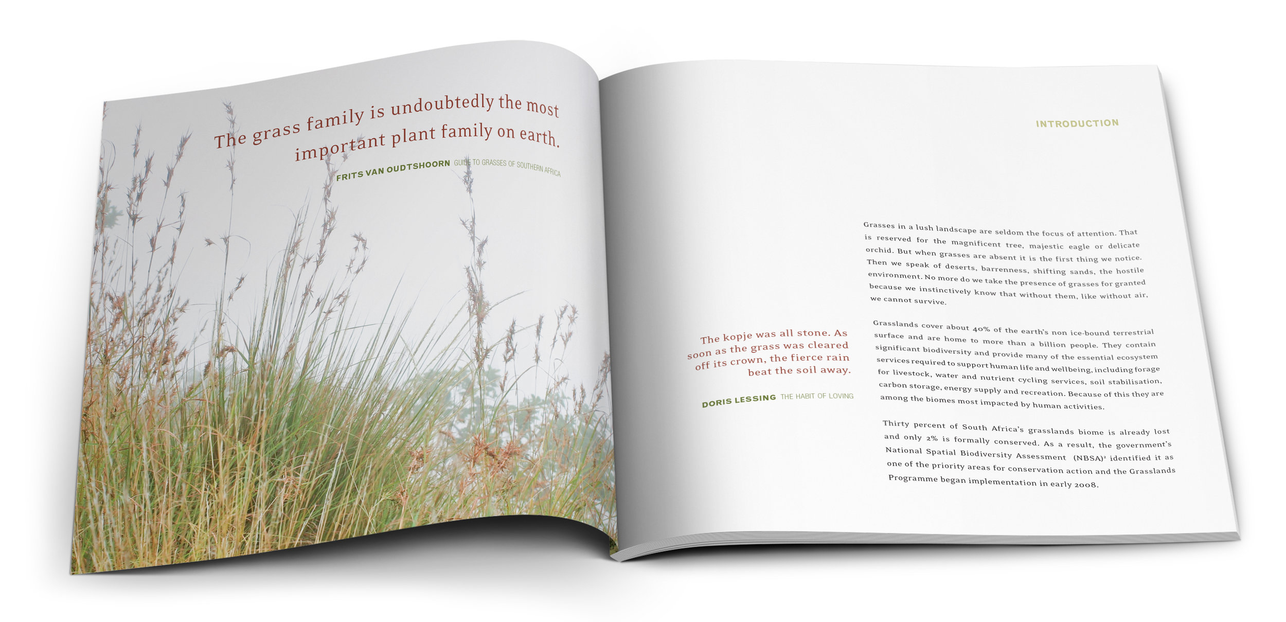
A richly photographic and informative book about the grasslands of South Africa. The pages include a combination of beautifully presented data, illustrated elements and crafted typography.
Report design is a careful balance between creativity and usability. This report was designed for UNICEF Lesotho and, with careful consideration of the UNICEF brand identity, the text heavy document was designed and laid out as a beautiful, reader friendly report. Statistics and facts were illustrated and expressed as infographics and margin pull quotes help the reader navigate the content.
The cover design of this psychological thriller illustrates the main subject of the story, with a sense of foreboding introduced by the empty swing and acidic colours. The personal style of the writing is communicated through the use of a handwritten font.
The cover aesthetic is carried through to the interior page design, with a classic serif font used for the main text and the handwritten font again applied to express the personal notes that feature throughout the text. A park-bench icon was designed as a text divider, to continue the theme and add visual interest.
The integrity of the crafted paper-page design is retained in the digital format with flexible, classically simple text and the park-bench text divider.
Technical ePub production by EBW.
This book incorporates dense, informative text alongside rich image content. Full spread images, inset images as well as single page images are laid out to correspond with the relevant text, which is set for easy reading.
To guide the reader, each section in the book is colour coded, with the section opener page employing an inverted image with a colour overlay and bold typography.
The overall design is understated and elegant, with the evocative photography as the main focus.
Wits University Press published this third edition of PR Kirby’s original research of the unique music of the indigenous people of southern Africa. It was a privilege to work on this fascinating book, which is the only one of its kind.
The aesthetic of this book references design of the 1930’s, when the book was first published, while simultaneously incorporating contemporary typographic styling and page layout.
Original archival photography was re-scanned and carefully retouched. Musical notations were transcribed and are included throughout the book. A wealth of knowledge is once again accessible to the public in this beautiful, case-bound book.
This autobiographical book details the story of wool in the Western Cape of South Africa. It showcases resilient, creative people who are contributing to livelihoods in places where decent work is hard to find.
Finding the Thread is a self-published book that includes beautiful photography and a sensitively feminine typographic design treatment.